Introduction
In the world of project management, it is essential to highlight the significance of visualizing project timelines and tasks. Project managers have long relied on Gantt charts as a cornerstone tool for displaying project schedules, dependencies, and progress. With the rise of data-driven decision-making, integrating Gantt charts into business intelligence tools like Microsoft Power BI has become essential. In this article, we explore the functionality and features of Gantt chart Power BI visuals available on the Microsoft AppSource Marketplace, presenting a summary of our expert assessment conducted by PM ERA.
Gantt Chart Power BI Visuals: A Quick Overview
Gantt chart visuals are a crucial component of any project management dashboard, enabling project managers to visualize timelines and allocate resources effectively. To fulfill this role, a Gantt Chart visual should incorporate the following key requirements and features:
- Hierarchical Task Representation: The Gantt Chart should have the capability to illustrate tasks in the form of a Work Breakdown Structure (WBS) with a hierarchical structure. This allows for a clear and organized representation of tasks and their dependencies, helping teams understand the project’s structure at a glance.
- Milestone Representation: The Gantt Chart should have the capability to represent milestones correctly, regardless of whether they are Start Milestones or Finish Milestones. This feature ensures that all significant project events are accurately depicted on the Gantt Chart.
- Task Progress Tracking: The Gantt Chart should have the capability to show the progress of individual tasks. This feature enables project managers and team members to monitor task completion and identify potential delays or bottlenecks.
- Cut-Off Date Visualization: It should be capable of illustrating a cut-off or deadline date on the Gantt Chart. This visual cue is essential for keeping the project on track and ensuring that tasks are completed within the specified timeframe.
- Baseline Bars: The Gantt Chart should offer the functionality to display baseline bars for each individual task. Baseline bars represent the planned or original schedule, allowing for easy comparison with actual progress. This feature aids in identifying variances between the initial plan and the current project status.
Incorporating these requirements and features into a Gantt Chart enhances its usability and effectiveness in project management, facilitating better planning, tracking, and communication throughout the project lifecycle.
Microsoft AppSource Marketplace offers a variety of Gantt chart Power BI visuals, each with its unique set of features and capabilities.
PM ERA’s Expert Assessment
At PM ERA, we understand the importance of selecting the right tools for project management and reporting. To assist project managers and organizations, we undertook an expert assessment of Gantt chart Power BI visuals available on Microsoft AppSource Marketplace. It is important to note that our evaluation focused solely on functionality and features, without consideration of the cost (price) of each visual, as pricing plans can vary significantly between vendors.
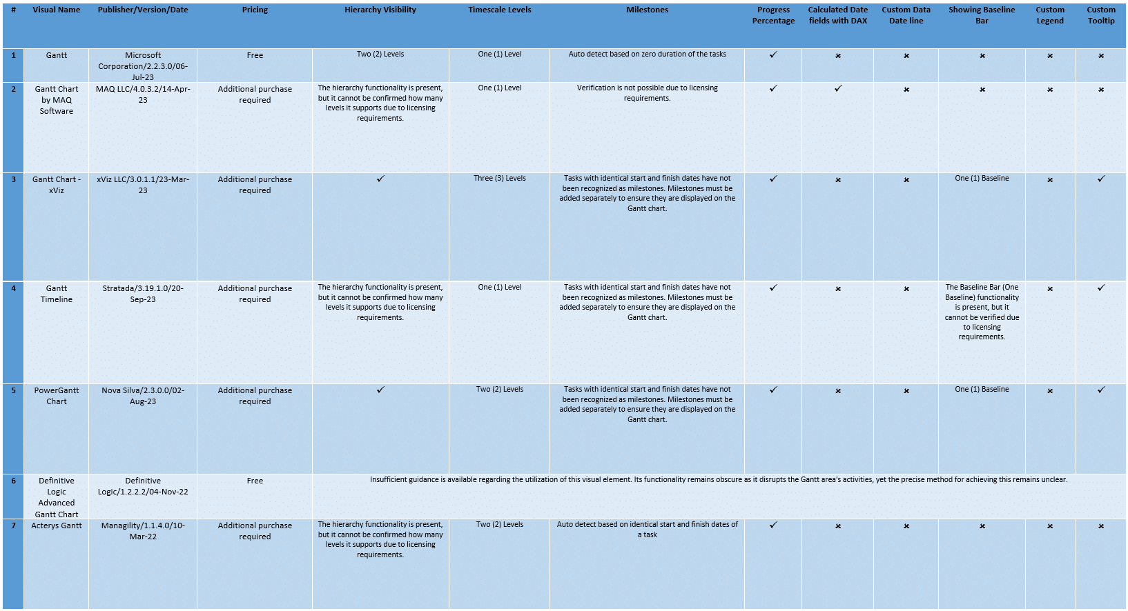
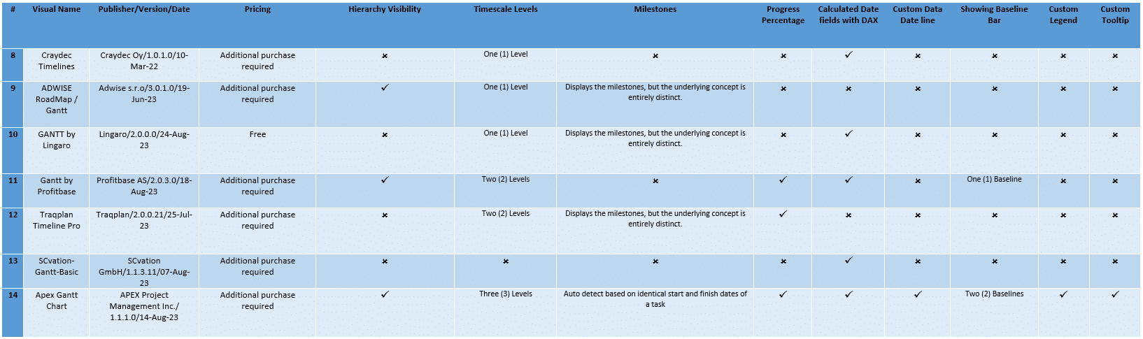
Summary of Key Findings
Below, we present a summary table highlighting the key findings from our assessment of Gantt chart Power BI visuals:
Disclaimer Clause
It is essential to recognize that this comparison has been conducted by PM ERA experts and should not be used as a sole or valid source for decision-making. The assessment solely focuses on the features and functionality of the Gantt chart Power BI visuals available on Microsoft AppSource Marketplace. We did not consider pricing plans, which may vary between vendors.
Conclusion
After conducting a thorough assessment of Gantt chart Power BI visuals accessible through the Microsoft AppSource Marketplace, APEX Gantt Chart has emerged as a standout performer. It exhibits remarkable capabilities in generating Gantt charts that closely mirror the results achieved by scheduling software like Primavera P6 and Microsoft Project.
While we emphasize the importance of project managers and organizations carefully assessing their individual needs and financial considerations in the selection process, it is undeniable that this visual tool distinguishes itself with its exceptional precision, extensive customization possibilities, and seamless integration with Power BI.